
Choosing a bathroom colour sounds simple until you’re standing in front of hundreds of almost-identical paint samples wondering whether you need warm white, cool white, ivory, stone, greige or something completely different.
Bathrooms are particularly interesting spaces to decorate because colour doesn’t come only from the walls.
Tiles, flooring, vanity units, baths, taps, mirrors and even grout contribute to the overall palette.
That means you can create a colourful bathroom without necessarily painting a single wall blue or green.
Here are 15 bathroom colour ideas, from timeless neutrals to darker and more characterful combinations.
1. Warm white, walnut and stone
Here the rich timber becomes effectively another colour.
The palette is approximately:
Warm white + walnut + taupe + soft grey
And because the bathroom has plenty of daylight, the darker wood doesn’t overwhelm the room.
2. Warm beige and chocolate brown
Beige bathrooms are much more interesting when you introduce darker contrast.
Rather than having one beige across every surface, use slightly different tones.
Think:
Sand + mushroom + cream + espresso brown.
The result is much softer than combining brilliant white with dark brown.
3. Soft grey and crisp white
4. Terracotta and dark brown
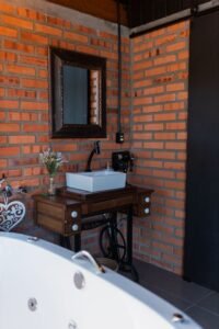
5. Sage green and warm white
Sage remains one of the easiest greens to introduce into a bathroom.
It works particularly well with:
- Warm white
- Oak
- Cream
- Brushed brass
- Natural stone
You could use sage on painted walls while keeping the shower area neutral, or introduce it through tiles behind the vanity.
For something more subtle, keep the bathroom neutral and use sage cabinetry instead.
6. Deep green and brass
If sage feels too safe, go considerably darker.
Forest and deep olive greens can create beautiful bathrooms, especially when combined with warm metallic finishes.
Try:
Deep green + warm white + walnut + brushed brass.
In a small bathroom, you could restrict the green to the vanity wall rather than covering the entire room.
7. Navy blue and white
Navy and white provide much stronger contrast.
White tiles or sanitaryware prevent navy from making the bathroom excessively dark, while timber can soften the scheme.
For example:
Navy vanity + white walls + white bath + oak shelving + brass hardware.
That’s enough colour to make the room memorable without committing to four navy walls.
8. Powder blue and cream
For something lighter, muted blue can create a fresh bathroom without the clinical appearance that sometimes comes with bright white.
Avoid pairing very pale blue with lots of cold grey if you want the bathroom to feel warm.
Instead, consider:
Dusty blue + cream + pale oak + warm white.
9. Black and warm white
Black bathrooms can look fantastic, but balance matters.
You don’t need black everywhere.
Black taps, shower frames, lighting or cabinetry can provide plenty of definition against lighter surfaces.
A useful ratio might be roughly:
70% light neutral + 20% natural material + 10% black accents.
It gives you the drama without turning the entire room into a dark box.
10. Greige and oak
Greige sits between beige and grey and is one of the easiest colours to coordinate with bathroom materials.
It works particularly well with oak because both have relatively natural undertones.
Try greige wall tiles with:
Oak vanity + white basin + cream towels + brushed nickel or brass taps.
It’s simple, but difficult to make look dated quickly.
11. Blush pink and burgundy
Pink bathrooms don’t have to look overly sweet.
Muted dusty pink becomes considerably more sophisticated when paired with deeper colours.
Try:
Blush + burgundy + cream + brass.
You could use blush tiles with a burgundy vanity or reverse the combination.
If both feel too strong, use burgundy only through towels and smaller accessories.
12. Terracotta and cream
Terracotta doesn’t need to mean exposed brick.
Clay-coloured tiles can create a warmer Mediterranean-inspired bathroom.
Pair them with cream rather than brilliant white for a softer transition.
Natural timber and aged brass complement the earthy palette particularly well.
13. Chocolate brown and ivory
Dark brown is becoming a useful alternative to charcoal or black.
Chocolate tiles or cabinetry paired with ivory can feel rich without being as harsh as black and white.
For a more luxurious appearance, add warm stone and brushed brass.
14. Charcoal and timber
Charcoal is ideal if you like contemporary bathrooms but don’t want pure black.
Combine charcoal tiles with medium or pale timber.
Then introduce plenty of white through the bath, basin and towels.
This creates three clearly defined layers:
Dark + warm + light.
That’s often much more visually interesting than using several slightly different greys.
15. Warm white and natural materials
Sometimes the best colour scheme barely uses conventional colour at all.
Start with warm white and introduce variation through:
Oak
Travertine
Limestone
Rattan
Linen
Warm metals
The room can remain extremely light while still feeling warm and layered.
Best bathroom colour combinations
If you’re struggling to put colours together, start with one of these combinations:
| Look | Colour combination |
|---|---|
| Warm & modern | Warm white + walnut + stone |
| Natural | Sage + cream + oak |
| Luxury | Chocolate + ivory + brass |
| Contemporary | Charcoal + timber + white |
| Classic | Navy + white + brass |
| Earthy | Terracotta + cream + walnut |
| Soft | Powder blue + cream + oak |
| Minimal | Greige + white + pale oak |
| Dramatic | Deep green + brass + warm white |
What are the best colours for a small bathroom?
You don’t necessarily have to paint a small bathroom white.
Lighter colours generally reflect more light and can make boundaries feel less visually dominant, but dark bathrooms can work surprisingly well too.
If your priority is making the space feel open, consider:
Warm white, cream, pale greige, sage, light blue or soft stone.
Keeping the floor and walls relatively similar in tone can also reduce strong visual boundaries.
Large mirrors and good lighting often have just as much impact on how spacious the room feels.
What bathroom colours make a room look expensive?
There’s no particular colour that automatically makes a bathroom look expensive.
The combination of colours and materials matters more.
For example:
Walnut + warm white + stone
can look extremely sophisticated.
So can:
Deep green + marble + brass.
What often makes a bathroom look less considered is introducing too many competing finishes.
Three or four coordinated materials usually look more intentional than seven different colours and finishes fighting for attention.
Should bathroom walls be lighter than the floor?
They don’t have to be.
A darker floor with lighter walls is a familiar combination because it visually grounds the room.
But you can also use similar tones across both surfaces for a more seamless appearance.
Another option is to reverse the traditional approach with darker walls and a pale stone floor.
The important thing is to look at the whole palette, rather than choosing the floor and wall colours independently.
What colour goes with grey bathroom tiles?
If you already have grey tiles, you have plenty of options.
Instead of adding even more grey, try introducing warmth.
Good combinations include:
Grey + oak
Grey + warm white
Grey + sage
Grey + navy
Grey + walnut
Grey + muted pink
Timber is particularly useful because it immediately softens a heavily grey bathroom.
What colour goes with a white bathroom?
Almost anything — which is exactly why white bathrooms are so easy to update.
If your bath, toilet, sink and tiles are white, you can introduce colour through the walls, vanity, towels and accessories.
For a warmer look, try sage, terracotta or beige.
For something dramatic, consider navy or deep green.
For a minimalist look, add pale oak and warm neutrals.
Don’t forget the colour of your lighting
This is especially important in bathrooms.
The exact same beige tile can appear warm and creamy under one light and strangely yellow under another.
Likewise, very cool lighting can make warm whites look dull.
Look at your samples under:
Natural daylight
and
Your actual bathroom lighting.
Don’t choose tiles under the extremely bright lights of a showroom and assume they’ll look identical at home.
Paint isn’t your only source of colour
When planning your bathroom, count every major material as part of the colour palette.
That includes:
- Wall paint
- Tiles
- Flooring
- Vanity
- Worktop
- Bath and basin
- Taps
- Shower frame
- Towels
- Mirrors
- Lighting
If you already have strong terracotta floor tiles, for example, you don’t necessarily need another bold colour on the walls.
The floor is already providing it.
Frequently Asked Questions
What bathroom colours are popular in 2026?
Warm neutrals, earthy colours, muted greens, natural timber tones and richer shades such as chocolate and burgundy fit particularly well with the move towards warmer, more natural-looking interiors.
Is grey still a good bathroom colour?
Yes. Grey remains extremely versatile. Pairing it with warmer materials such as timber, cream, brass or muted green can create a softer contemporary look.
What colour is best for a relaxing bathroom?
Soft greens, warm neutrals, muted blues and natural material palettes are commonly used to create calmer-looking bathrooms. Lighting and personal preference are equally important.
What colour should I paint a windowless bathroom?
Warm white and lighter neutrals are safe options, but a windowless bathroom doesn’t have to be pale. Deep colours can create an intentionally dramatic effect if the artificial lighting is planned properly.
Should the bathroom ceiling always be white?
No. White is practical and familiar, but matching the ceiling to the walls can create a more enveloping appearance. Just make sure you’re using paint suitable for bathroom conditions.
Test colours before committing
Bathroom colours are particularly sensitive to lighting because there are so many reflective surfaces.
Glossy tiles, mirrors, shower glass and polished taps all bounce light around the room.
So don’t choose your final paint colour from a phone screen.
Get samples and look at them in your actual bathroom throughout the day.
And when choosing paint for areas exposed to humidity, make sure the product is suitable for bathroom use.
Final thoughts
The best bathroom colour ideas aren’t necessarily the most fashionable ones.
Choose a palette that works with the things that are expensive or difficult to replace — particularly your tiles, flooring, bath and vanity.
Then use paint, towels and accessories for colours you may want to change later.
A bathroom built around two or three complementary colours plus one accent will usually be much easier to keep visually coherent than one containing every trend at once.
Planning a bathroom makeover?
Whether you need a painter, tiler, plumber or complete bathroom renovation specialist, The Right Guy can help homeowners find local tradespeople for their project.

Author: manager
Company test